Google News redesign: whitespace and scrolling galore on desktop
Google News for the desktop has been redesigned by Google to make the desktop version of the service "more accessible and easier to navigate".
Google notes that the new user interface has a "clean and uncluttered look", that the new card format is "easier to browse", and that the new layout focuses on "key elements" such as "publisher names and article labels".
The company's designers have pretty much changed the whole interface of Google News. There is a new menu at the top to switch between headlines, latest news, personalized news, and regional news.
The left sidebar lists fewer links, and is only displayed when the width of the browser window exceeds a given minimum width.
The main pane uses a card design now, as does the right pane which offers weather information, fact checking, and "in the news" topics.
Interests can be managed more easily on Google News now. All you need to do is click on the "your interests" link in the sidebar after selecting "for you" at the top.
Google News issues
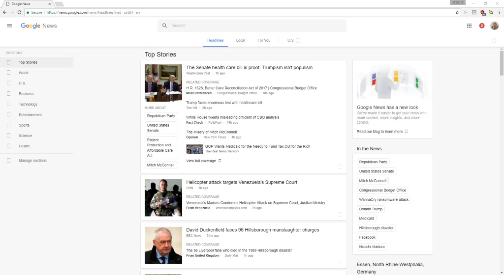
If you open Google News on a full HD or larger screen, you will notice that it makes use of a lot of whitespace (light gray actually). The screenshot above has been captured on a Full HD screen; if you open it on a 4K monitor or widescreen monitor, you get even more whitespace in the process.
Another change that you may notice if you used Google News before is that articles include titles only in the new interface.
Google News displayed the first sentence previously underneath each article. The sentence has been replaced with links to related coverage instead.
The number of news articles has been reduced as well. A quick comparison between the old and new design sees a reduction of articles by more than half. There is top news at the top of the page, and then half the articles that were there before.
Part of it comes from the use of larger thumbnail images, another from using larger font sizes for displaying text in the main pane. Google's own before after shot shows seven news articles in the old design, and only three on the new.
What this means is that you have to scroll more to browse the same number of news articles on Google News.
What you can do about it
A userstyle has not been created yet to improve the site's accessibility on large displays, or make it more efficient in terms of scrolling.
What you may do however is make use of RSS feeds by loading topics of interests, and clicking on the RSS Feeds link at the bottom of the page afterwards.
This loads the RSS feed for that particular topic. You can subscribe to it in some web browsers (Firefox and Opera support this for instance), by using feed readers for the desktop (QuiteRSS is my reader of choice), or online feed services.
Now You: What's your take on the Google News redesign?
This article was first seen on ComTek's "TekBits" Technology News

- Log in to post comments